Starting the year off right…. In January, Lazzaro Designs was the recipient of a 2024 Gold CVA Award for The Brooklyn Heart Center patient education brochure Maryellen designed in 2023.
The CVA Awards are the nation’s premiere competition recognizing design excellence in cardiac and vascular service lines. We are pleased to say that our 2024 award joins many more Maryellen has won over the years.
 Lazzaro Designs refreshed the appeal brochure of the New York Fighterfighters Burn Center Foundation. While the Foundation is wholeheartedly supported by firefighters, they can’t realize future goals alone. They need support from individuals, the business community and other organizations to allow them to expand their important efforts. This 16-page brochure is their appeal. Within the brochure you can read about the Foundation and its history. Shown above, the appeal’s front cover and a spread highlighting how the Foundation also sends youngsters to burn camp.
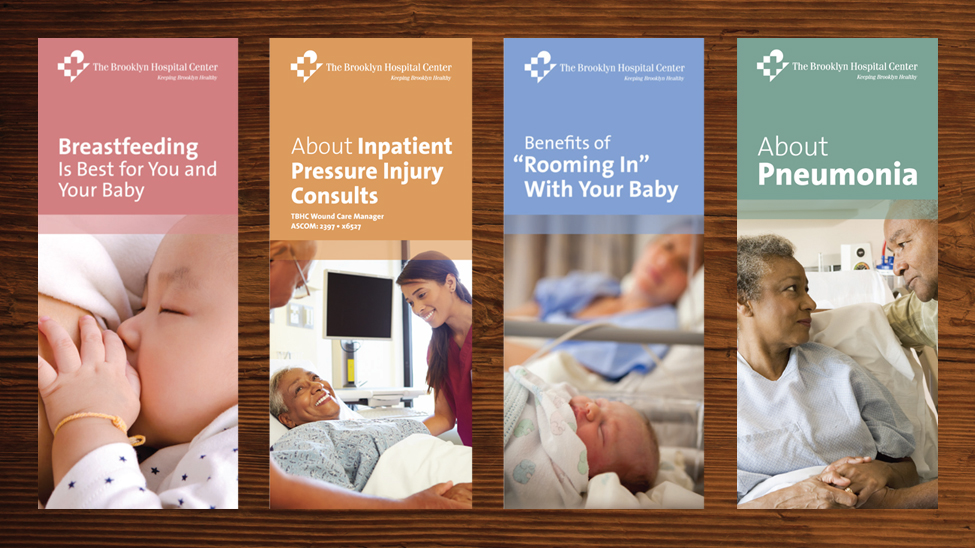
 The evergreen brochure. Whether it’s a bifold (four panels) or a trifold (six panels), a brochure by our definition folds into a #10-size business envelope and fits easily in that envelope, brochure holder or purse. We are doing a fair number of these budget-conscious, easy-to-read pieces for The Brooklyn Hospital Center as ongoing consultants.
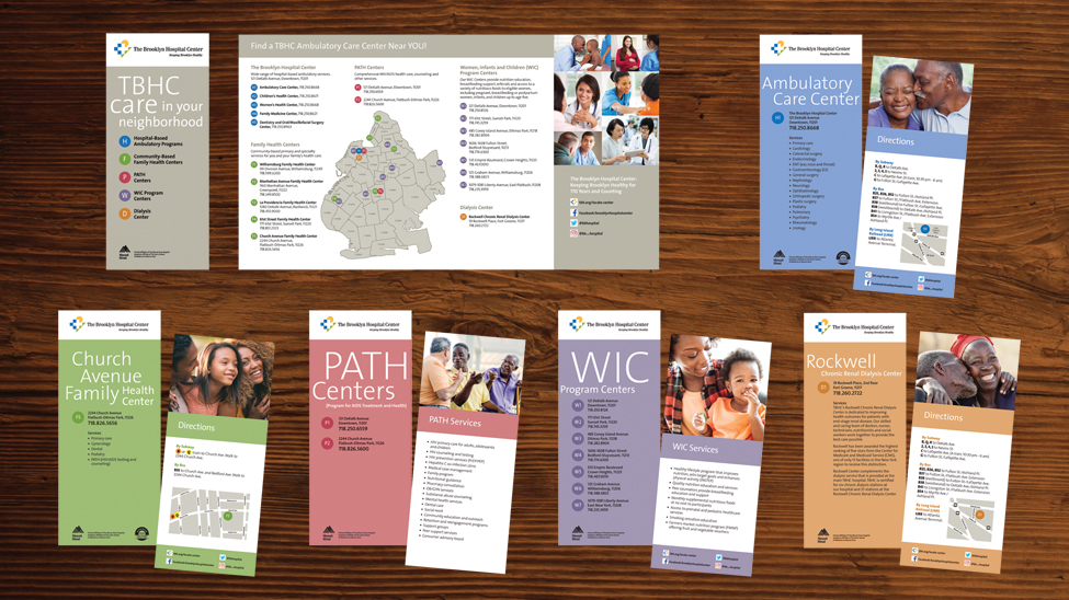
 The Brooklyn Hospital Center turned to Lazzaro Designs to visually convey its ambulatory care network across the hospital’s primary and secondary service areas. Their network consists of five hospital-based ambulatory care centers, five community-based family health centers, two PATH centers, seven WIC program centers and one dialysis center.
First, a Brooklyn map separated by zip codes was prepared identifying the location of the hospital in Downtown Brooklyn. Second, the five service lines were identified by fives colors selected from the hospital brand guidelines. Third, the location of each service line program was pinned on the map. The map’s key categorized by service line named and numbered each program location as well as provided the street address, phone number, neighborhood and zip code. For example, H = hospital-based location and H1 through H5 represented the five centers within the hospital.
Next came preparing the vehicle to house all the information. A quadfold brochure that easily fits into a #10 envelope was designed. The quadfold featured an inside pocket to contain 13 inserts. That’s when the earlier color coding (blue for hospital-based centers, green for community-based family health centers, red for PATH centers, purple for WIC program centers and orange for dialysis centers came in handy along with the numbering. For example: F5 (Church Avenue Family Health Center located in Flatbush-Ditmas Park) was the fifth of five community-based family health centers and W4 (WIC program located in Bedford-Stuyvesant) was the fourth of six WIC hospital programs.
The quadfold containing all 13 inserts were provided to referring physicians to distribute to patients as well as included in Emergency Department patients’ discharge packets. Additionally, each site location was provided with the corresponding insert further marketing the program’s services.


 Lazzaro Designs refreshed the appeal brochure of the New York Fighterfighters Burn Center Foundation. While the Foundation is wholeheartedly supported by firefighters, they can’t realize future goals alone. They need support from individuals, the business community and other organizations to allow them to expand their important efforts. This 16-page brochure is their appeal. Within the brochure you can read about the Foundation and its history. Shown above, the appeal’s front cover and a spread highlighting how the Foundation also sends youngsters to burn camp.
 The evergreen brochure. Whether it’s a bifold (four panels) or a trifold (six panels), a brochure by our definition folds into a #10-size business envelope and fits easily in that envelope, brochure holder or purse. We are doing a fair number of these budget-conscious, easy-to-read pieces for The Brooklyn Hospital Center as ongoing consultants.
 The Brooklyn Hospital Center turned to Lazzaro Designs to visually convey its ambulatory care network across the hospital’s primary and secondary service areas. Their network consists of five hospital-based ambulatory care centers, five community-based family health centers, two PATH centers, seven WIC program centers and one dialysis center.