 The Brookdale University Hospital Medical Center wanted a residency recruiting brochure to effectively sell their educational programs to graduating medical students applying for residencies. When considering a significant brochure, many clients have a knee-jerk instinct to fill the first few pages with messages from important people.
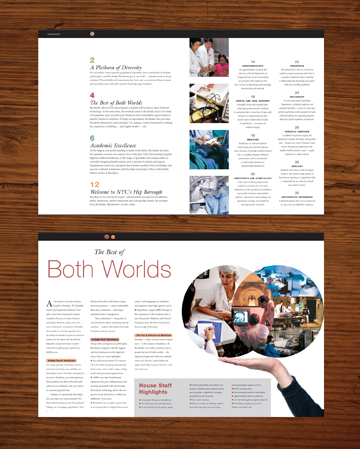
We encouraged the Medical Education Department to consider a fresher approach. Their audience was young with their generation’s need to be immediately and visually captivated and an impatience for long entries. Using a consumer magazine approach, Lazzaro Designs created a brochure with brief messages tucked neatly on the first page. We helped the Chairman, CEO and Chief Medical Officer craft single-paragraph messages. The three paragraphs together served as a cohesive message and key phrases were enlarged to jump out at the reader even if she couldn’t be bothered to read further. The first spread was dedicated to a visually arresting and splashy table of contents (shown, top image). Even if a would-be physician failed to turn another page, he would get a good overview of the center’s highlights from short, pithy paragraphs summarizing each section.
Throughout the 36-page brochure, spreads told each section’s message with lots of subheads and catchy headlines like “The Best of Both Worlds” (shown, bottom image), to portray Brookdale’s combination of high-tech and hands-on teaching, and “Welcome to NYC’s Hip Borough” to tout the institution’s Brooklyn location.
> If you need help marketing to a younger generation or with any major brochure, give Lazzaro Designs a call or shoot us an email.
 Several years ago, Lazzaro Designs was retained to create what the client called an “annual report” for the Department of Orthopaedics at Beth Israel Medical Center. After an in-depth meeting where we asked questions and listened, we helped the client focus their attention on creating a major capabilities brochure, with all the impact and pizzaz of an annual, but without the “financials” that the word “annual” implies. We understood their needs were threefold: 1) drive patient referrals, 2) make a splash in the orthopedic community at large given their status as a renowned center of excellence, and 3) provide material for philanthropic giving. Here’s specifically what we did:
Voice: Lazzaro Designs organized the 36-page book primarily around the subdivisions with a hefty physician directory at the end. Our writer undertook the massive job of interviewing all the key players of each division and consolidating all the salient points into concise, professional, but accessible copy. She also wrote the tagline for the book that captured the department’s mission.
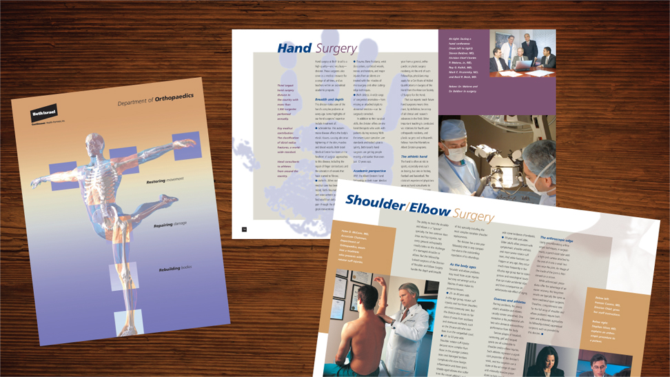
Vision: Maryellen created spreads that enticed with eye-popping design that relied on a savvy mix of photography, illustration and exciting use of color to reflect the dynamic department. She created a theme using a significant image or object for each spread to illustrate the subdivision—an xray image for joint reconstruction, various balls for sports medicine, a teddy bear for pediatrics. She also designed a stunning cover featuring the perfect anatomical illustration to convey the book’s thematic tagline: “Restoring movement, Repairing damage, Rebuilding bodies.”
Getting it Done: Lazzaro Designs project-managed the enormous effort, including coordinating the interview and approval processes. We also retained and coordinated the photographer for all the significant photos throughout the book, arranging and facilitating the individual physician appointments during a series of headshots days, and providing numerous on-site facilitation and art direction for all such efforts.
The client was thrilled with the impressive result, which had all the gravitas of an annual report, but a longer shelf life. For years, the department proudly used the book and witnessed a boost in referrals and donor dollars.
> If you need help creating a capabilities brochure or annual report, give Lazzaro Designs a call or shoot us an email.
 The Brookdale University Hospital Medical Center wanted a residency recruiting brochure to effectively sell their educational programs to graduating medical students applying for residencies. When considering a significant brochure, many clients have a knee-jerk instinct to fill the first few pages with messages from important people.
 Several years ago, Lazzaro Designs was retained to create what the client called an “annual report” for the Department of Orthopaedics at Beth Israel Medical Center. After an in-depth meeting where we asked questions and listened, we helped the client focus their attention on creating a major capabilities brochure, with all the impact and pizzaz of an annual, but without the “financials” that the word “annual” implies. We understood their needs were threefold: 1) drive patient referrals, 2) make a splash in the orthopedic community at large given their status as a renowned center of excellence, and 3) provide material for philanthropic giving. Here’s specifically what we did: