We are pleased to announce that Lazzaro Designs will be creating a series of new capabilities brochures for The Silvercrest Center. One brochure will be designed for families to present the facility’s expertise in respiratory and rehabilitation services. Another brochure for families will promote Silvercrest’s outpatient rehabilitation services. For both projects, condensed trifolds will be created targeting referring physicians.
The Silvercrest Center turned to Lazzaro Designs for a transit ad to advertise to the community that they had a robust outpatient rehabilitation program. Silvercrest is known for its excellent long-term care, but most neighbors do not think of it as an option for important outpatient rehabilitation.
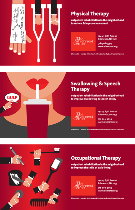 The three transit ads, each measuring 30″ x 60″, we created were recently installed on subway stop entrances. The client also reproduced them as posters to use in their facility and elsewhere. Here’s specifically what we did:
Voice: Silvercrest at first asked for one single ad to capture all three services. We, however, recommended separate ads that could be installed throughout the catchment area for best impact, yet could each stand alone. Streamlined ad copy was written that emphasized the major point that these quality services were available nearby.
Vision: Silvercrest recently changed its logo color to the NewYork-Presbyterian red (because of its affiliation with the medical network). The facility is also in the process of updating its web site with a whole new look. Knowing that the red was going to be a key player in Silvercrest’s future marketing efforts, Maryellen chose to focus on that color so it would work with anything currently being developed. Maryellen picked symbolic representations of the specific services from stock vector art, but also created some elements of the art herself to blend seamlessly with what was purchased. The result is eye-catching and modern and sets Silvercrest apart from its competition.
Getting it Done: Maryellen served as a liaison between the creative team and the client, as well as with NewYork-Presbyterian’s Marketing Department, which signed off on the ads.
> If you need help creating ads for transit, print or the web, give Lazzaro Designs a call or shoot us an email.
We are pleased to announce that Lazzaro Designs will be updating a Q&A series for The Silvercrest Center. We created the original family of 12 pamphlets with essential information on relevant topics for patients, families and staff alike, such as on infection control, compliance, pressure ulcers, and pain management. For a remarkable nine years, the Q&As served their purpose; now the organization is seeking to update their content. A brand-new pamphlet on discharge planning will also be created. As for the design, the timelessness of the formatting will remain unchanged.
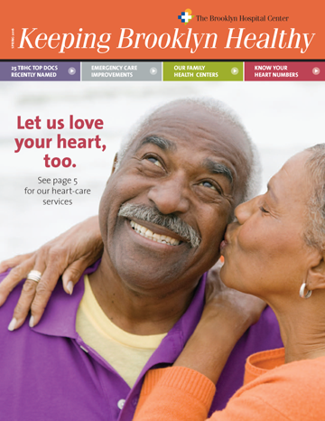 Lazzaro Designs recently launched a biannual community newsletter for The Brooklyn Hospital Center. Here’s specifically what we did:
Voice: Editorially, we brainstormed articles with the client that showcased updates on the hospital’s programs that would be of interest to the changing community’s long-timers and newcomers alike. We encouraged the client, for instance, to include a box of how to connect with the hospital on social media. We also worked with the client to name the publication “Keeping Brooklyn Healthy,” which is the hospital’s tagline.
Vision: Maryellen wanted the newsletter to reflect the uniqueness of this hospital in so far that it’s a true, independent community hospital with a long history of serving Brooklyn. She wanted the newsletter to also capture present-day Brooklyn’s dynamic diversity and neighborhood friendliness. The hospital, through this publication, stands for warmth and accessibility without stinting on sophistication of services. To accomplish these goals visually, Maryellen made use of the strong colors in the logo’s and branding guideline’s palette. For the all-important front cover, she chose a big, magazine-style image and used a navigational bar style to highlight the main information within the newsletter. Because the client’s image budget was limited, we made use of their archives as much as possible, limiting the purchase of stock images. For instance, Maryellen in her research, noticed a photo on the hospital’s web site for emergency services. An archive search allowed us to use it in this print publication, not only saving money, but also providing visual consistency across the client’s marketing platforms.
Getting it Done: Lazzaro Designs project-managed the newsletter, creating a yearly publication schedule, triggering key meetings and conference calls, overseeing the approval processes, and serving as a liaison between the creative team and the client. Maryellen also worked with the printer/mailhouse to strategize ways to lower printing, postage and distribution costs.
> If you need help creating a newsletter that speaks to your community, give Lazzaro Designs a call or shoot us an email.