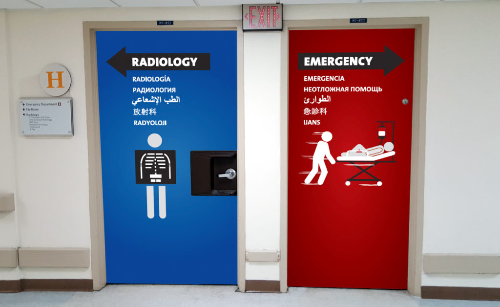
 Upon exiting a bank of elevators within The Brooklyn Hospital Center you faced a wall with two (different width) locked doors and a small sign indicating the radiology department and the emergency department was located on this floor. This led to potential confusion on how to get to these departments. Lazzaro Designs way-finding solution was to create two adhesive door wraps making it clear which way to the department a patient or visitor was seeking.
The door wrap designs featured the department’s name translated into Spanish, Russian, Arabic, Chinese and Creole to accommodate the hospital’s multicultural service area. The cut away for door hardware was also factored into the designs.
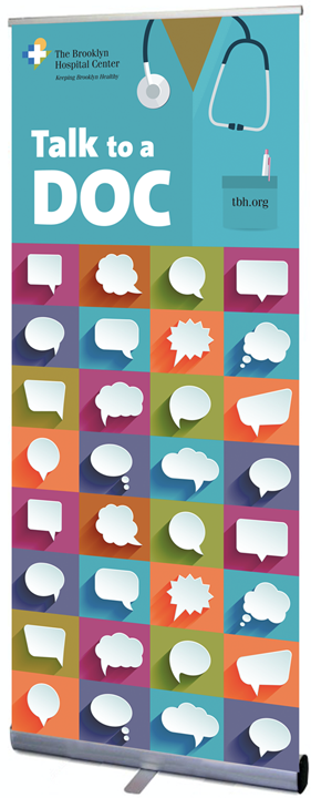
Lazzaro Designs recently produced the art for a retractable banner for The Brooklyn Hospital Center. When the banner is fully opened it measures nearly 3 ft. wide x 6.5 ft. tall. Its height measures about 6 inches when closed for ease of transport.
In this instance, the design was tailored to the Talk to a Doc initiative where the hospital arranges for its doctors to set up a booth at venues such as BAM and Barclays Center and be available to speak to patrons.
This banner design with its talk bubbles placed in a grid allows for the height to be adjusted when placed on a desk top without losing the core message
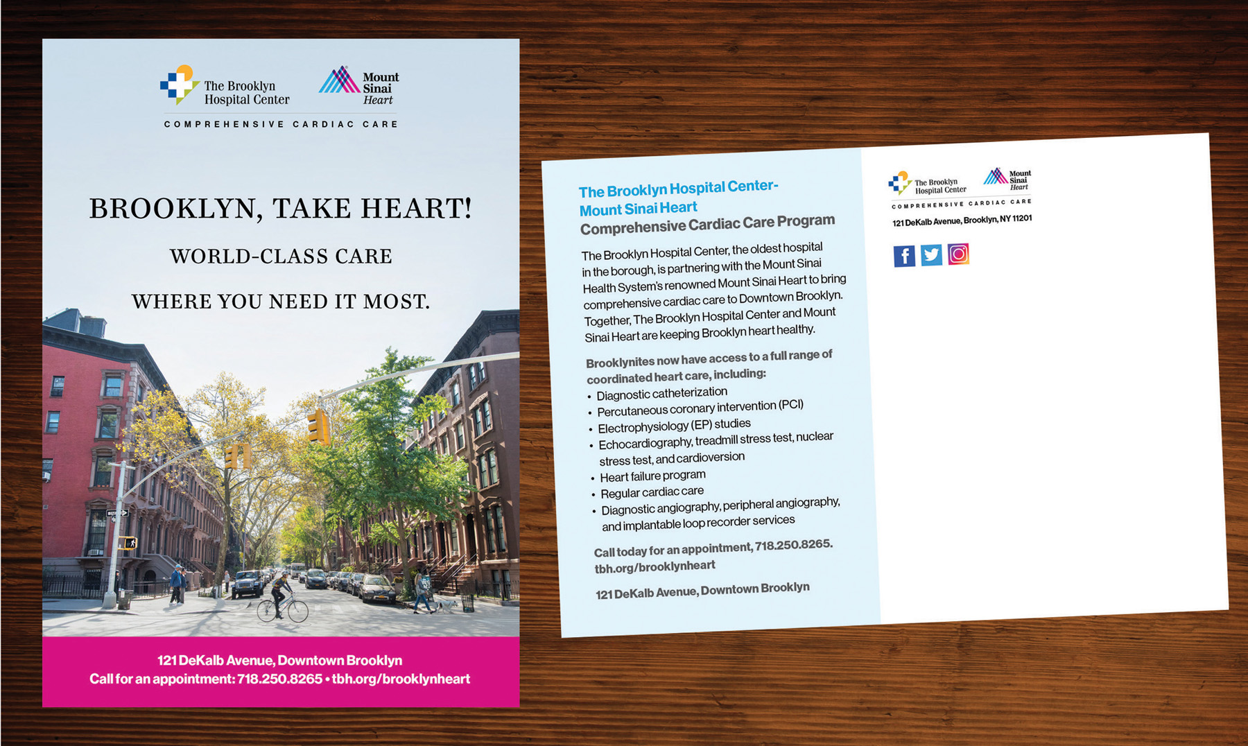
Lazzaro Designs (on retainer with The Brooklyn Hospital Center) recently collaborated with Mount Sinai Health System to produce an ad campaign and brochures highlighting the hospitals’ new clinical partnership that brings comprehensive cardiac care to a large segment of Brooklyn that previously didn’t have easy access to this level of care.
Maryellen also designed campaign postcards to referring physicians and to prospective patients (the latter, shown here) for distribution to TBHC’s primary and secondary service areas. She also designed collateral for the joint venture reception that took place at TBHC.
However, the most interesting part of the campaign was capturing an original image to reflect Downtown Brooklyn with its quintessential array of people. Rather than scouting on site, Maryellen used google map’s virtual tour feature to identify the ideal street and cross street to photograph as well as to identify the angle the photographer was to shoot. On the day of the shoot, the photographer took multiple shots of peeps (dog walker, bicycle rider wearing a helmet, senior couple) and we seamlessly photoshopped them into the final image. We also added a lot of leaves in the trees since many had already fallen and removed the trash from garbage containers!
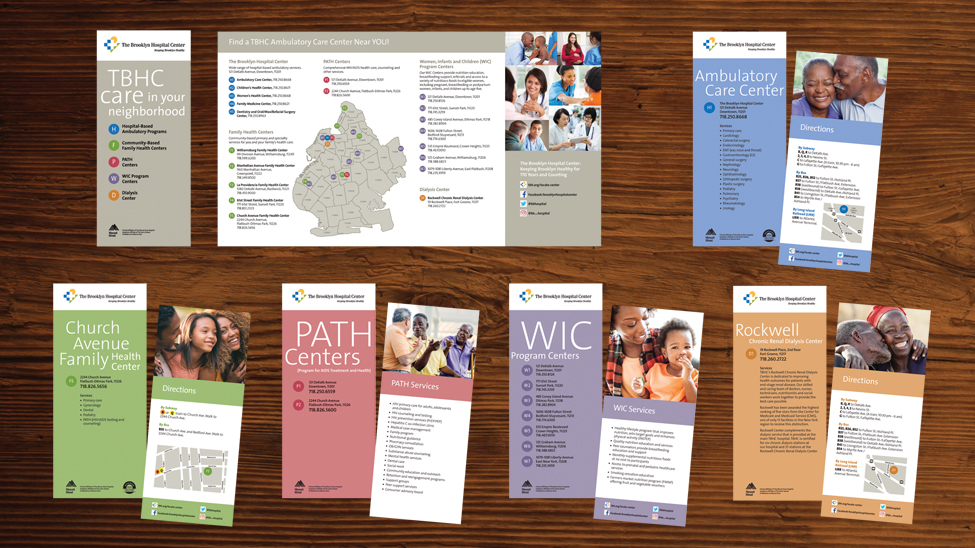 The Brooklyn Hospital Center turned to Lazzaro Designs to visually convey its ambulatory care network across the hospital’s primary and secondary service areas. Their network consists of five hospital-based ambulatory care centers, five community-based family health centers, two PATH centers, seven WIC program centers and one dialysis center.
First, a Brooklyn map separated by zip codes was prepared identifying the location of the hospital in Downtown Brooklyn. Second, the five service lines were identified by fives colors selected from the hospital brand guidelines. Third, the location of each service line program was pinned on the map. The map’s key categorized by service line named and numbered each program location as well as provided the street address, phone number, neighborhood and zip code. For example, H = hospital-based location and H1 through H5 represented the five centers within the hospital.
Next came preparing the vehicle to house all the information. A quadfold brochure that easily fits into a #10 envelope was designed. The quadfold featured an inside pocket to contain 13 inserts. That’s when the earlier color coding (blue for hospital-based centers, green for community-based family health centers, red for PATH centers, purple for WIC program centers and orange for dialysis centers came in handy along with the numbering. For example: F5 (Church Avenue Family Health Center located in Flatbush-Ditmas Park) was the fifth of five community-based family health centers and W4 (WIC program located in Bedford-Stuyvesant) was the fourth of six WIC hospital programs.
The quadfold containing all 13 inserts were provided to referring physicians to distribute to patients as well as included in Emergency Department patients’ discharge packets. Additionally, each site location was provided with the corresponding insert further marketing the program’s services.