 Last spring, Lazzaro Designs created a series of three transit ads for The Silvercrest Center, each touting an outpatient rehab expertise. The ads were designed to be displayed together for high impact, yet could each stand alone. The client was so pleased with the result that they requested we turn the ads into posters, which were installed on site at the facility.
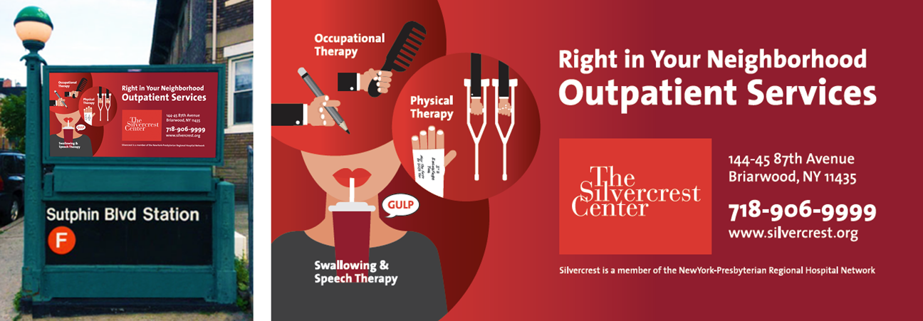
Recently, Silvercrest came to us again asking for a version of the campaign that incorporated all three design elements into a single ad. The plan is to feature this single ad prominently at key subway station entrances. In particular, they wanted the Swallowing and Speech service to have the most prominence, given that Silvercrest has renowned expertise in this specialty.
The result is as eye-catching as the original campaign, yet recognizable, serving to further remind the local audience of this excellent resource in their midst.
> If you need help creating an ad, give Lazzaro Designs a call or shoot us an email.
The Silvercrest Center turned to Lazzaro Designs for a transit ad to advertise to the community that they had a robust outpatient rehabilitation program. Silvercrest is known for its excellent long-term care, but most neighbors do not think of it as an option for important outpatient rehabilitation.
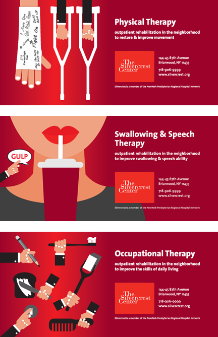 The three transit ads, each measuring 30″ x 60″, we created were recently installed on subway stop entrances. The client also reproduced them as posters to use in their facility and elsewhere. Here’s specifically what we did:
Voice: Silvercrest at first asked for one single ad to capture all three services. We, however, recommended separate ads that could be installed throughout the catchment area for best impact, yet could each stand alone. Streamlined ad copy was written that emphasized the major point that these quality services were available nearby.
Vision: Silvercrest recently changed its logo color to the NewYork-Presbyterian red (because of its affiliation with the medical network). The facility is also in the process of updating its web site with a whole new look. Knowing that the red was going to be a key player in Silvercrest’s future marketing efforts, Maryellen chose to focus on that color so it would work with anything currently being developed. Maryellen picked symbolic representations of the specific services from stock vector art, but also created some elements of the art herself to blend seamlessly with what was purchased. The result is eye-catching and modern and sets Silvercrest apart from its competition.
Getting it Done: Maryellen served as a liaison between the creative team and the client, as well as with NewYork-Presbyterian’s Marketing Department, which signed off on the ads.
> If you need help creating ads for transit, print or the web, give Lazzaro Designs a call or shoot us an email.