 Last spring, Lazzaro Designs created a series of three transit ads for The Silvercrest Center, each touting an outpatient rehab expertise. The ads were designed to be displayed together for high impact, yet could each stand alone. The client was so pleased with the result that they requested we turn the ads into posters, which were installed on site at the facility.
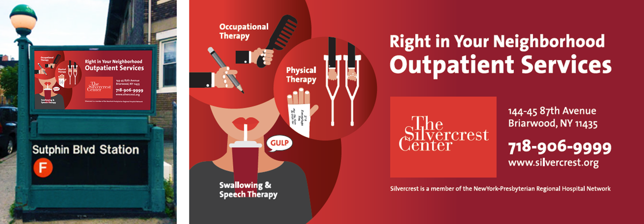
Recently, Silvercrest came to us again asking for a version of the campaign that incorporated all three design elements into a single ad. The plan is to feature this single ad prominently at key subway station entrances. In particular, they wanted the Swallowing and Speech service to have the most prominence, given that Silvercrest has renowned expertise in this specialty.
The result is as eye-catching as the original campaign, yet recognizable, serving to further remind the local audience of this excellent resource in their midst.
> If you need help creating an ad, give Lazzaro Designs a call or shoot us an email.
 Goodbye, old website. You were created by a developer, and you were 40+ pages of a muddled mess that lacked a clear message and unifying look.
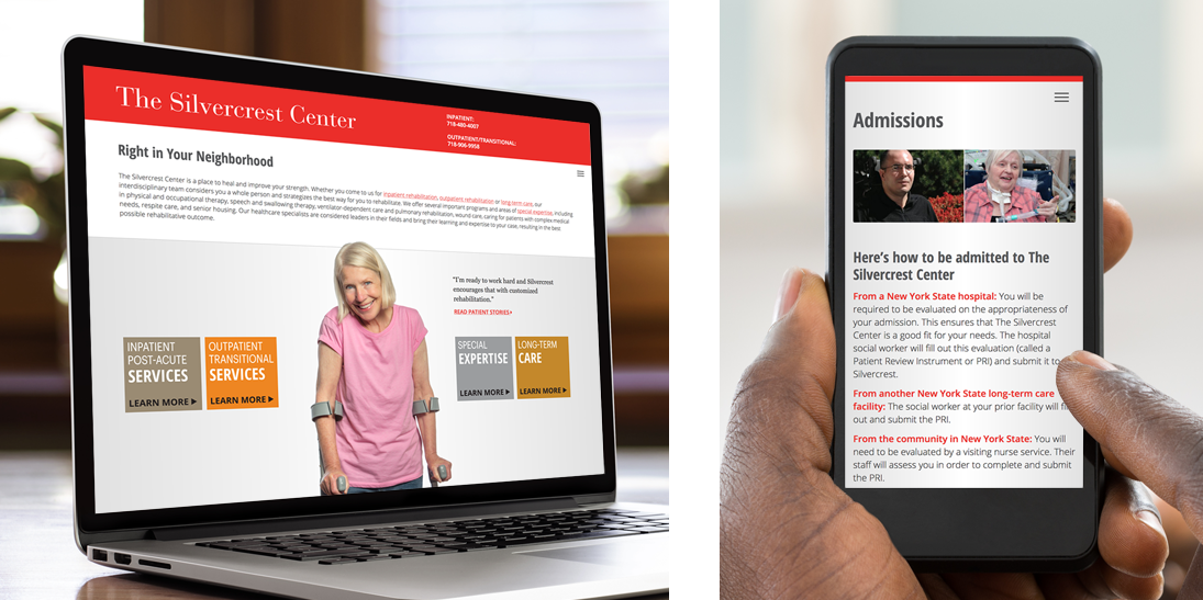
Hello, new website! You are fresh, clean and modern, like the printed materials Lazzaro Designs produced in 2016. You set Silvercrest apart from its post-acute care competition.
Here’s how we did it.
Our first step was to prepare the site map. With our editorial collaborators, we gathered the many pages and reorganized and consolidated the content into major categories and sub-categories, resulting in an easily managed 12 pages. The organization was outlined by a site map that indicated which page would link to what other page.
Then we made decisions about various considerations that would continue to improve the user’s experience. For example, we determined that the header would be “sticky,” meaning it doesn’t move while the user is scrolling on a desktop, laptop or tablet. In this way, the two key phone numbers placed in the header are accessible at all times.
All these essential steps were done before a word was written or Maryellen designed a page. Once we got the green light from the client on the site map, Lazzaro Designs got to work on that.
Voice: Copy was written to complement the print materials already produced and to immediately provide the user with an approachable vehicle to learn about the facility and its mission, as well as to access its breadth of services. The writer determined what would be the main headers (H1s) and the subheads (H2s) to break up the blocks of copy. In some cases, the writer created “accordion-style” content, pages of mini sections that just show the subheads and click open to reveal the rest of the narrative if the user so desires. This way the user doesn’t have to plow through a long scroll to get to only what she is interested in. The writer also edited various blog entries that were written by key staff members and put in place blog categories and tags to further improve the user’s experience.
Vision: Unlike printed material, designing a website means to think in modular sections that will resize and reposition for the user’s device. For Silvercrest, the first step Maryellen did was select a one-deck logo treatment. This let the name read cleanly regardless of the user’s device. She made many more decisions, as well, from web fonts to color palette, however, only two page formats needed to be designed—the homepage and an interior page. Maryellen then created the art for the supporting ‘learn more’ buttons, and limited the amount of photos used throughout the site’s main pages. Iconic images were culled from Silvercrest’s archives, supplemented with a few stock images. A few new photos were taken to round out the assets featured on the site.
Getting it done: Once Silvercrest approved each page’s layout, including the copy, images and how the site would function with links, Lazzaro Designs researched web developers who could translate our work. Silvercrest chose Chroma Sites from our recommendations. Maryellen oversaw the work prepared by Chroma Sites and served as a liaison between The Silvercrest Center and the developer. The entire process, starting with the development of the site map to going live, took under five months.
Check out the print materials Lazzaro Designs produced thus far for Silvercrest, all which beautifully complement the website: Family brochures. Clinician brochures. Patient handbook. Transit ads. Q&A trifolds.
> If you need help creating or updating your website, give Lazzaro Designs a call or shoot us an email.
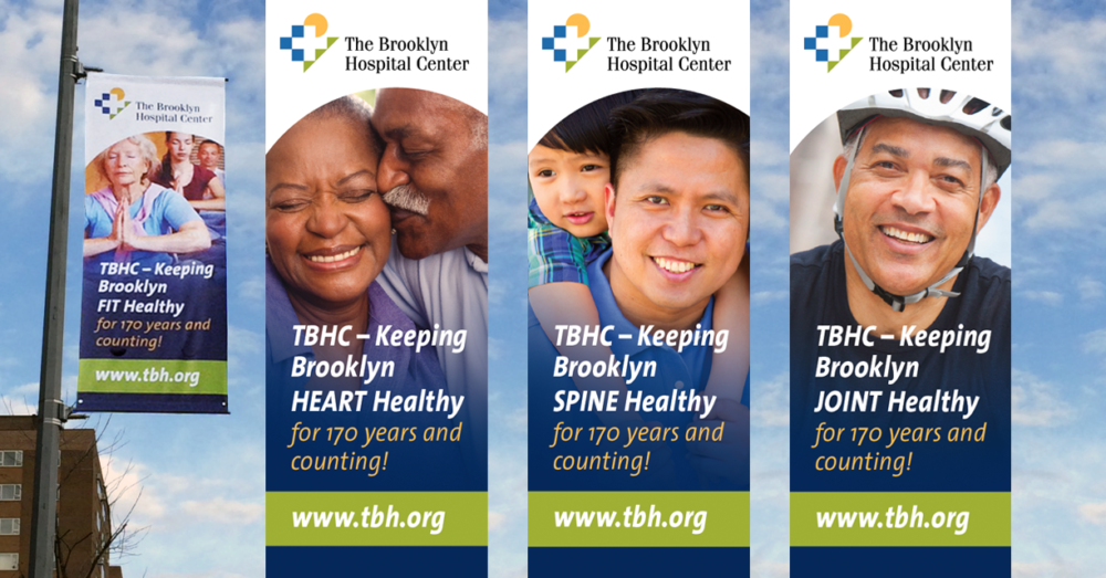
Lazzaro Designs designed a series of street banners for The Brooklyn Hospital Center. Each banner measures 3 ft x 8 ft. The various banners are on display around the hospital and in nearby Fort Greene Park.
The vertical banners’ design complements the horizontal banner Maryellen created, which is installed by the hospital’s emergency entrance.
Tip: When considering an outdoor banner, have the banner vendor provide your designer with the specs detailing where the wind slits and grommets will be located and how much space to leave for the horizontal pole sleeves.
> If you need help creating banners, give Lazzaro Designs a call or shoot us an email.
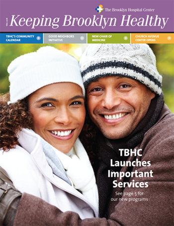 Lazzaro Designs is pleased to announce that the fall issue of Keeping Brooklyn Healthy, The Brooklyn Hospital Center’s biannual community newsletter, has been published.
Voice: In this issue, Maryellen worked with the writer to create the headlines and format for what will be an ongoing series on upcoming calendar dates, community engagement efforts, and photo collages of recent events. As before, other articles highlighted news and services, such as a significant clinical appointment, the opening of an ambulatory care center, a hospitalist program, and a wound care and hyperbaric program.
Vision: Building on the design created for the inaugural issue, Maryellen continued to employ similar criteria for colors, photos and page layouts to create a visually arresting and informative issue that remains consistent with the client’s larger marketing efforts.
Getting it Done: Maryellen facilitated communication with the client, the writer and the printer.
> If you need help creating a newsletter that speaks to your community, give Lazzaro Designs a call or shoot us an email.