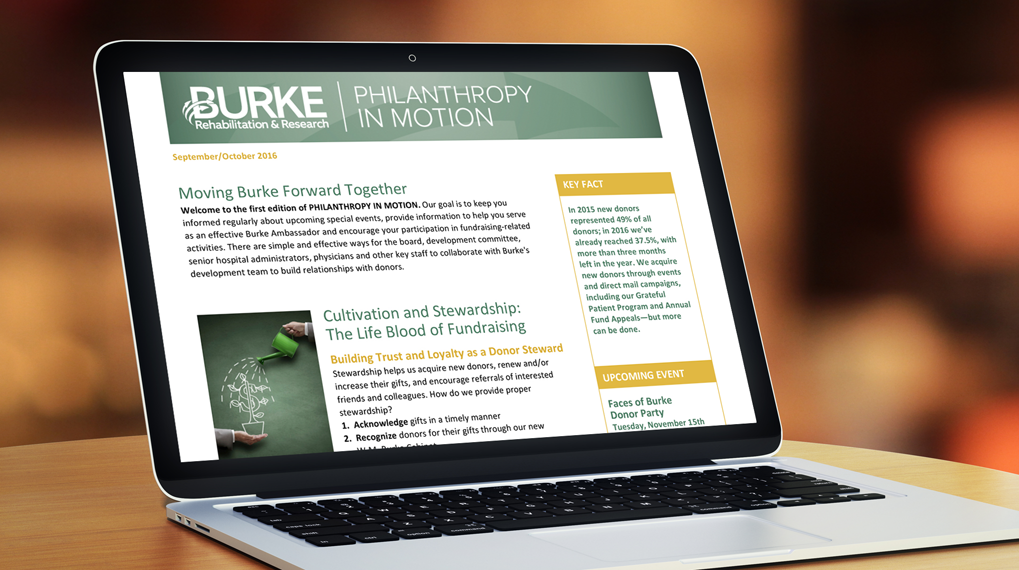
Maryellen Lazzaro designed the premiere issue of Philanthropy in Motion, a bi-monthly e-newsletter that Burke Rehabilitation Hospital sends to its Burke Ambassadors; she will continue as its designer for future editions. This audience consists of board trustees and top administrators and physicians, as well as other key staff. The publication is designed to guide Burke leaders on how to collaborate with Burke’s development team to build relationships with donors and would-be donors. The newsletter also keeps its readers informed of special events and activities.
Maryellen designed the clean, attractive piece with the client’s branding in mind and it has received excellent feedback.
> If you need help creating a newsletter that speaks to your community, give Lazzaro Designs a call or shoot us an email.
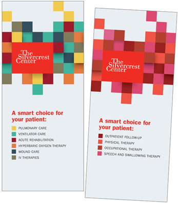 After we updated our own materials for The Silvercrest Center (including a patient handbook and Q&A informative brochures) and created some new subway ads, the client also asked us to create new brochures for referring clinicians. The goal of the folded 8.5 x 11″ trifolds was to market Silvercrest’s outstanding programs in both inpatient and outpatient rehabilitation.
Voice: Using a concise, professional tone, the brochures quickly outline the overall excellence of each program and highlight the key elements that contribute to their renowned reputation.
Vision: For the covers (shown here), Maryellen worked with the logo’s red and modified some beautiful stock art to create a modern, clean look. Each trifold stands alone, yet, together, they clearly work as a complementary pair.
Getting it Done: As always, Lazzaro Designs facilitated a smooth process for the project. The writer interviewed key clinicians at the institution for the content and worked with the client for approval rounds. Maryellen sought bids from the printer of the client’s choice and served as a liaison between the client and printer.
The client is very pleased with the crisp, informative results, which will set The Silvercrest Center apart from its competition, as it rightly deserves.
> If you need help creating brochures for any audience, give Lazzaro Designs a call or shoot us an email.
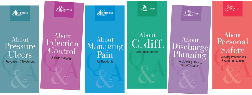
Nearly 10 years ago, The Silvercrest Center turned to Lazzaro Designs for a series of informative pamphlets on topics such as infection control, flu immunizations and pain management. We created a Q&A series of a dozen such pamphlets and they were well used and widely distributed to patients, family and visitors. But time passed and information needed to be updated. Here’s specifically what we did:
Voice: The to-the-point Q&A theme worked beautifully and continues to work well. Other than updating the content, the voice remained the same. If it ain’t broken, no need to fix it.
Vision: Similarly, the pamphlet format was deemed effective and the general look was retained since it complemented the look of the new patient handbook. The pamphlets are placed in the handbook’s inside pockets and are placed in holders throughout the facility. Changing the color of the rectangle behind the logo aids in quickly differentiating one pamphlet from another.
Getting it Done: Maryellen served as a liaison between the creative team and the client, getting these important communications back in the hands of those who need them.
> If you need help creating informative trifolds or a family of pamphlets, give Lazzaro Designs a call or shoot us an email.
 In 2007, Lazzaro Designs created for The Silvercrest Center an original, 6 x 9″, 20+-page handbook with essential information for patients and families, such as about the care team, telephone and television services, visitors, and meals, among many other topics. Silvercrest needed to editorially update the handbook and wanted a way to tweak copy themselves as the need arises.
Voice: The original editorial voice continued to work well and was little changed beyond content updates and some fresh reorganization of topics. The title was rewritten to better reflect new branding messages.
Vision: For the cover, Maryellen picked up the theme of the new logo color (the NewYork-Presbyterian red; Silvercrest is affiliated with the medical network) and opted for a clean, modern design that fits in well with the body of new work we are doing for Silvercrest. The format lends itself well to both print and digital, too. The 24 all text, interior pages were prepared in MS Word, which makes it easy for Silvercrest staff to edit with the regular changes that happen within the facility. However, since MS Word is not a layout program and the handbook measures 9.5 x 11.25″ in order to house loose correspondence in the handbook’s interior pockets, providing Silvercrest’s printer with a MS Word 8.5 x 11″ document was not an option. As such, Maryellen created an .eps file of each handbook page. She then re-created the handbook in a layout program based on a 9.5 x 11.25″ page size and placed each .eps page into the layout in order to provide the printer with a suitable file.
Getting it Done: Maryellen facilitated a smooth process for the project, from approvals to working with the printer. In addition, Maryellen provided the master MS Word file to Silvercrest staff for their future updates along with instructions on what to provide their printer. Likewise, she provided Silvercrest’s printer with the current handbook’s layout file and support .eps files along with instructions on what they need to do when they receive updates to the handbook from Silvercrest.
> If you need help creating a manual or handbook, give Lazzaro Designs a call or shoot us an email.


 After we updated our own materials for The Silvercrest Center (including a
 In 2007, Lazzaro Designs created for The Silvercrest Center an original, 6 x 9″, 20+-page handbook with essential information for patients and families, such as about the care team, telephone and television services, visitors, and meals, among many other topics. Silvercrest needed to editorially update the handbook and wanted a way to tweak copy themselves as the need arises.