EXTENDED-CARE MARKETING EDITION

You know your audience and you have scheduled time to regularly write your blog entries, but still the blank page yawns in front of you. Never mind that it’s a computer screen and the only one doing the yawning is you! You are blocked, my friend. Here are six ways to break writer’s block. Work through them in order until the words flow!
1. Ditch distractions. Turn off your phone, sign off of Facebook, and consider turning down the music. On that last one, there are mixed reviews. Some writers love to work with music. Kim, on the other hand, can’t pen a sentence unless it’s library quiet. So if you’re stuck, try turning it off…or on if it helps.
2. Speak, don’t write. You’re not writing, not really. You’re talking. Talking is easy! Just speak to a person in your audience (Maybe, Gabby Grown Daughter) and capture what you’re saying on paper.
3. Become a story-teller. Using anecdotes and reporting real-life situations are powerful ways of conveying a message. For instance, don’t just write the tip, “Keep your siblings abreast of decisions about your parent in care.” Tell the story instead of how Deidre scheduled a conference call on the first of every month with her brother and sister to discuss the latest updates on Mom. Explain how that call made all the difference in airing conflicts, clearing up confusions, delegating tasks and brainstorming new approaches.
4. Throw out the timer. Instead of saying, “I’ll write for 30 minutes,” put your fingers on the keyboard and don’t pick them up until you have 250 words. Even if somewhere in there you start to peter out, type “yadda yadda yadda” until real words come back to you. Don’t be overwhelmed: 250 words fill only one double-spaced, typed page of copy.
5. Write terribly. If you’re editing while you’re writing, bad news. There is no better way to block your writer self than by turning on your editor self. Give yourself permission to write the words unchecked—yadda yaddas and all—until you get to 250. If you feel better and your entry remains undone, keep going until you hit the end. Then leave it there and…
6. Go for a walk. Even if music was working for you during the writing process, turn it off now. Walk for a bit—15 minutes or so—and let the words you wrote bubble in your mind. Don’t overthink, don’t force it. You might realize as you walk that your entry would be improved by adding a patient quote or a perspective from one of your care providers. Maybe that last paragraph was unecessary and repetitive. Maybe nothing comes to mind but the chirping of birds. That’s ok, too. Finish your walk, go back to the computer, adjust your copy from what you thought about from your stroll and then put your editing hat on to polish those words up. More on that in the next entry.
Congratulations, you are officially unblocked!
> If you need help building or bettering a blog or writing entries, give Lazzaro Designs a call or shoot us an email.
> Coming soon: Tips to Polish Your Writing.
We are pleased to announce that Lazzaro Designs will be creating a series of transit ads promoting their outpatient rehab services for The Silvercrest Center. Silvercrest is a member of the NewYork-Presbyterian Regional Hospital Network.
EXTENDED-CARE MARKETING EDITION
 Can you enliven your blog and improve your page views with just photos and videos? Sure, but it will be even that more interesting visually and that more relevant in content if you consider other images, too, such as infographics, charts, and quote cards.
For example, when reviewing your editorial calendar’s upcoming entries, you might realize that:
• “Parkinson’s disease in the elderly” lends itself to an eye-catching free infographic.
• “Broad range of therapeutic recreation activities” drives your point home when you add an original infographic.
• “Employee satisfaction continues to rank high” is better captured with a chart that easily conveys the statistics.
• “Celebrating National Nurses’ Week in May” makes a bold statement with a quote card.
Here are some tips to help you unearth or create interesting images for a lot less (and sometimes for free!).
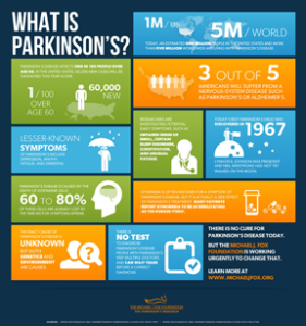 Free infographics. Many large healthcare systems and national nonprofit organizations associated with older adults (or the conditions to which older adults are vulnerable) produce infographics on a variety of healthcare topics and some of their infographics may be well-suited to your extended-care’s blog. These organizations typically provide the HTML embed code for each of their infographics to encourage you to use these professional-quality infographics on your blog. We found this Parkinson’s disease infographic for free on The Michael J. Fox Foundation for Parkinson’s Research website.
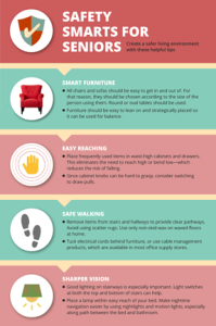 Create original charts and infographics. One of our favorite ways for our extended-care clients to create charts and infographics is through Piktochart. Every template is fully customizable and the tools are intuitive and easy to use. First let’s address charts. A chart is actually a kind of infographic. You pick a chart style that works best (pie chart, a bar graph), plug in your data and the site creates the art for you. Similarly, with infographics, you pick the template that best suits your message and plug in your images and words and customize colors and fonts, as we have done here with our senior safety tips infographic.
Piktochart is available as a free account, but we recommend that you upgrade to a nonprofit pro account for $40 a year. The free account offers only about a dozen templates with some limitations such as the .png provided comes with a Piktochart watermark. The nonprofit pro account, on the other hand, gives you access to hundreds of templates, increases upload space up to 400MB, gives you the ability to download your infographic in various files sizes and types for use in potential print material, and allows you to remove their watermark.
 Quote cards. You’ve likely seen plenty of quote cards, but you may have not realized that that’s what they are called. Basically, you can feature a quote from one of your residents, patients, family member or staff member—or locate an applicable quote from a famous person on the internet—and place it over a colorful background. To show you that it doesn’t require any special expertise, we created the nursing quote card shown here using MS Word and then took a screenshot to crop it. The screenshot is a .png extension, which is the perfect file format for use on a blog or other social media platform.
Don’t know how to take a screenshot? On a PC, press the Windows logo key plus PrtScn. On a tablet, press the Windows logo button plus the volume down button. Your shot will be saved as a file in the Screenshots folder (which is in your Pictures folder). On a Mac, press Command-Shift-4, move the crosshair pointer to where you want to start the screenshot, drag to select the area, and then release your mouse or trackpad button. You’ll find the screenshot as a .png file on your desktop.
Final tip: Whenever you’re creating original infographics, charts or quote cards, keep your organization’s branding in mind. If possible, choose the fonts and colors that are in your logo or other branding efforts.
REMEMBER: Your time and cost investment in your original visual content will reap rewards because images, including infographics, charts and quote cards, can be used again and again like photos and videos throughout your other social media efforts.
> If you need help building or bettering a blog or using visuals of any kind, give Lazzaro Designs a call or shoot us an email.
> Coming soon: Tips on how to write a terrific blog entry.
 Five years ago, Lazzaro Designs was retained to create a quarterly e-newsletter for Healthcare Leaders of New York (HLNY), the New York Metropolitan chapter of the American College of Healthcare Executives, an international professional society of more than 40,000 healthcare executives. And for five years, we have been writing, designing and project-managing this popular communication tool that is released to the chapter’s 1,800+ members.
For the most recent issue, the client and we decided it was time to refresh the look of the piece especially in light of the organization’s launch of a new website. Here’s specifically what we did:
Voice: Editorially, the basic elements of the original e-newsletter remain, including messages from key leaders, links to upcoming events, member profiles, and useful advice for healthcare executives from the early careerist to the seasoned pro. We continue to interview the profiled members, write fresh copy, and provide editorial support for the organization’s leaders as they craft their messages.
Vision: Before she tackled how the piece would look, Maryellen recommended that HLNY consider using a template in Mailchimp (the organization’s mail delivery system). This eliminated a previously outsourced html coding step, making the redesigned e-newsletter more efficient to produce.
The new look features banners for each section, which were created using a combination of photos of HLNY members, images from their website along with stock icons. The new design complements the look of their website and translates well on any device.
Getting it Done: As they have for the past five years, Lazzaro Designs continues to project-manage the quarterly ongoing project, keeping the editorial calendar, triggering conference calls to brainstorm content, and ensuring that the e-newsletter gets delivered in a timely fashion.
> If you need help creating an e-newsletter with value-added content, give Lazzaro Designs a call or shoot us an email.


 Can you enliven your blog and improve your page views with just
  Free infographics. Many large healthcare systems and national nonprofit organizations associated with older adults (or the conditions to which older adults are vulnerable) produce infographics on a variety of healthcare topics and some of their infographics may be well-suited to your extended-care’s blog. These organizations typically provide the HTML embed code for each of their infographics to encourage you to use these professional-quality infographics on your blog. We found this Parkinson’s disease infographic for free on The Michael J. Fox Foundation for Parkinson’s Research website.
 Create original charts and infographics. One of our favorite ways for our extended-care clients to create charts and infographics is through
  Quote cards. You’ve likely seen plenty of quote cards, but you may have not realized that that’s what they are called. Basically, you can feature a quote from one of your residents, patients, family member or staff member—or locate an applicable quote from a famous person on the internet—and place it over a colorful background. To show you that it doesn’t require any special expertise, we created the nursing quote card shown here using MS Word and then took a screenshot to crop it. The screenshot is a .png extension, which is the perfect file format for use on a blog or other social media platform.
 Five years ago, Lazzaro Designs was retained to create a quarterly e-newsletter for Healthcare Leaders of New York (HLNY), the New York Metropolitan chapter of the American College of Healthcare Executives, an international professional society of more than 40,000 healthcare executives. And for five years, we have been writing, designing and project-managing this popular communication tool that is released to the chapter’s 1,800+ members.