 The Silvercrest Center turned to Maryellen Lazzaro to design an invitation for its Annual Golf Classic. Maryellen created a fresh look that is a continuation of the client’s modern, yet classic new brand.
Silvercrest retained Lazzaro Designs last year and for this upcoming year to create many new marketing pieces and update some old ones. Take a look at what we’ve done so far for Silvercrest.
> Want to set your next event apart from its competition? Give Lazzaro Designs a call or shoot us an email.
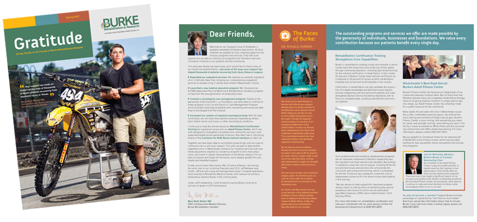
 Maryellen Lazzaro designed the premiere issue of Gratitude, a quarterly newsletter that Burke Rehabilitation Hospital sends to its donors; she will continue as its designer for future editions. The publication is designed to keep donors abreast of Burke’s accomplishments, showcase key initiatives where funding is needed, keep readers informed of special donor events and activities, recognize cabinet-level donors—and most significantly—thank donors and show how their support has made an impact on thousands of Burke patients recovering from traumatic injury or illness.
Future cover images will continue to feature patients who have rehabbed at Burke along with their inspiring stories.
The newsletter has received excellent feedback. In fact, Burke’s Sr. VP of Marketing, Communications & Development relayed to Maryellen: “You did an excellent job on the design. It really fits into the look and feel of our overall branding, so thank you for respecting that.”
Maryellen also designs their bimonthly e-newsletter targeted to Burke ambassadors, as well as designed their Development Plan.
If you need help creating a newsletter that speaks to your community, give Lazzaro Designs a call or shoot us an email.
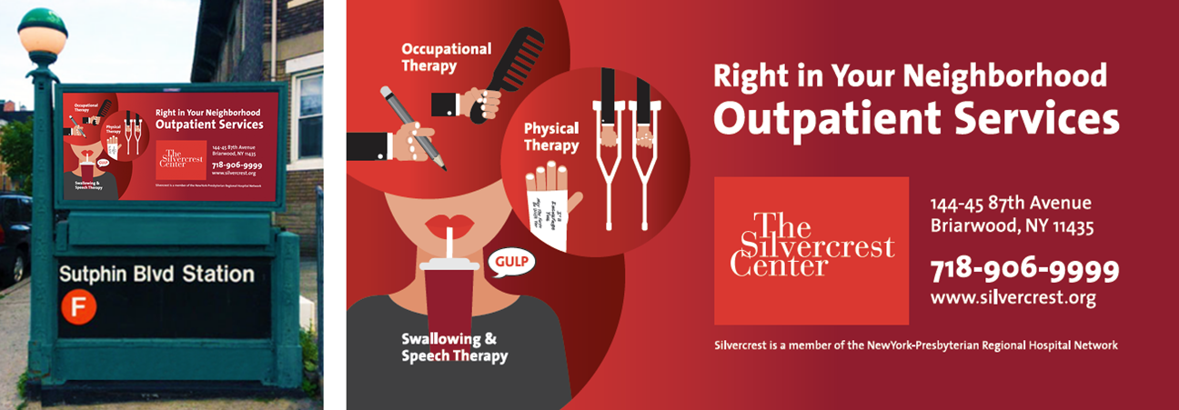
 Last spring, Lazzaro Designs created a series of three transit ads for The Silvercrest Center, each touting an outpatient rehab expertise. The ads were designed to be displayed together for high impact, yet could each stand alone. The client was so pleased with the result that they requested we turn the ads into posters, which were installed on site at the facility.
Recently, Silvercrest came to us again asking for a version of the campaign that incorporated all three design elements into a single ad. The plan is to feature this single ad prominently at key subway station entrances. In particular, they wanted the Swallowing and Speech service to have the most prominence, given that Silvercrest has renowned expertise in this specialty.
The result is as eye-catching as the original campaign, yet recognizable, serving to further remind the local audience of this excellent resource in their midst.
> If you need help creating an ad, give Lazzaro Designs a call or shoot us an email.

The Silvercrest Center, a member of NewYork-Presbyterian Regional Hospital Network, adapted its marketing focus to emphasize its full spectrum of post-acute rehabilitation services. Lazzaro Designs was hired to freshen the center’s marketing pieces to reflect this new approach… and in the process Silvercrest was rebranded.
Silvercrest previously removed their old logo’s identifier leaving the remaining “The Silvercrest Center” looking weak and unbalanced. The first task we undertook was to place a red 4:3 rectangle under the logo to restore presence and balance. Maryellen also decided on the primary fonts and color palette.
With these building blocks in place, our rebranding efforts were underway. A clean, modern design with accessible and to-the-point copy, was implemented across a wide range of materials, including a new website, clinician pamphlets and family brochures, an inpatient welcome handbook, transit ads, a Q&A trifold series and social media platforms.
The client was very pleased with the results of these efforts and has been receiving positive feedback from all their targeted audiences—patients, families, referring clinicians and colleagues.
> Want to set your organization apart from its competition, give Lazzaro Designs a call or shoot us an email.
 The Silvercrest Center turned to Maryellen Lazzaro to design an invitation for its Annual Golf Classic. Maryellen created a fresh look that is a continuation of the client’s modern, yet classic new brand.
 Maryellen Lazzaro designed the premiere issue of Gratitude, a quarterly newsletter that Burke Rehabilitation Hospital sends to its donors; she will continue as its designer for future editions. The publication is designed to keep donors abreast of Burke’s accomplishments, showcase key initiatives where funding is needed, keep readers informed of special donor events and activities, recognize cabinet-level donors—and most significantly—thank donors and show how their support has made an impact on thousands of Burke patients recovering from traumatic injury or illness.
 Last spring, Lazzaro Designs created